A quick introduction to Dark Mode: operating systems on phones and desktops have added support for Light and Dark modes in recent years. This allows the user to set their preference for one or the author or automatically switch during day and night time. Typically the Light mode displays a white background with dark text, the Dark mode with a dark background and white text. When someone visits your website, it’d be great to respect their preference just like the apps on their OS do. It shows them that you care about their preferences. Those little touches go a long way when it comes to websites and apps.
(Ironically, at the time of writing this post, this very website does not support Dark Mode yet. 😭 I’ll work on adding it soon!)
Let’s build upon the link-in-bio website from the HTML & CSS tutorial and add support for Dark Mode styles by targeting the prefers-color-scheme media query and adjusting the color values.
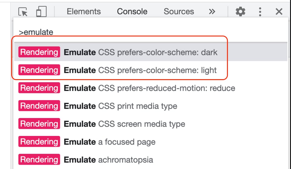
First, before we even get started, Chrome’s Dev Tools pane has a quick way to toggle between Light and Dark, making the development workflow even easier. Press Cmd+Shift+P on Mac or Ctrl+Shift+P on PC to open the command prompt. Type in “emulate” and you’ll see options for emulating light or dark mode. This is a really quick way to test your dark mode styles without switching your entire operating system’s setting.
Now that you can quickly switch between Light and Dark mode, let’s go over the code additions.
Add this meta tag to the head of your pages:
<meta name="color-scheme" content="light dark" />
That lets the browser know both schemes are supported.
Then, in your styles, use the prefers-color-scheme media query to target
specific elements with various color properties. If your site’s default theme
has a light background with dark text, then you’ll want to write styles for the
dark theme. You’ll target light if your default theme is a dark background.
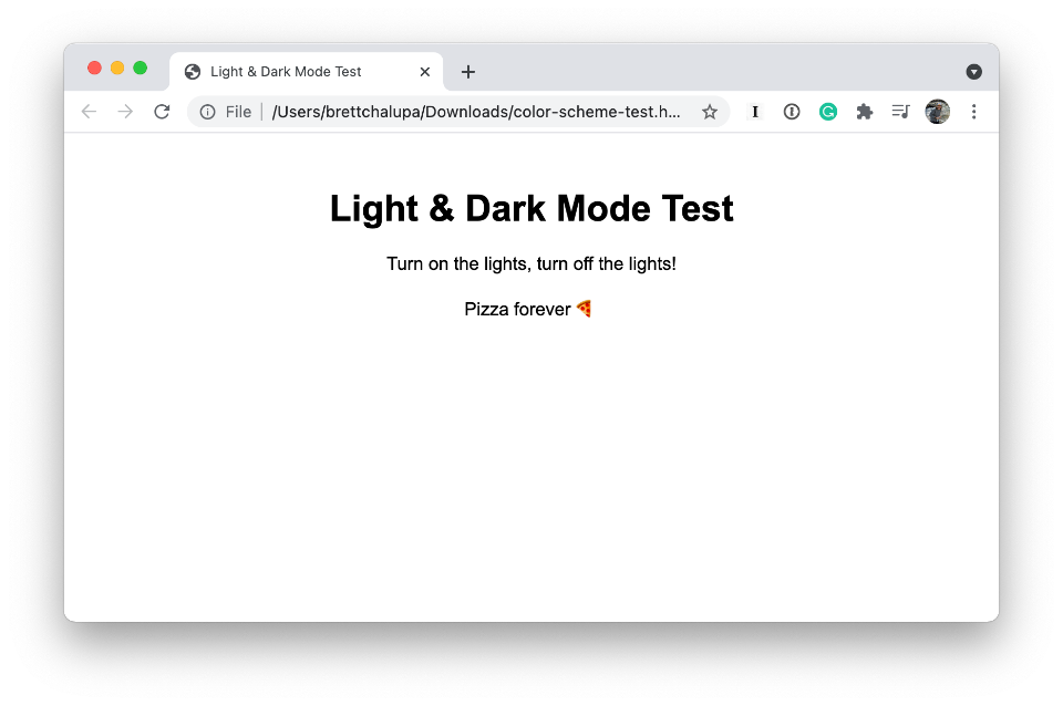
For example, here are some simple body styles:
body {
background: white;
color: black;
font-family: sans-serif;
}
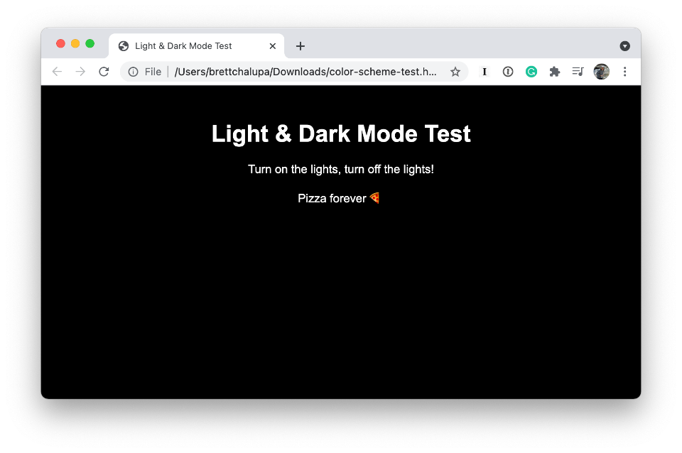
@media (prefers-color-scheme: dark) {
body {
background: black;
color: white;
}
}
This looks like the following…
Light mode:
Dark mode:
With a CSS Preprocessor like Sass/Scss
In the video above, I got into more depth with a little more complex styles,
but that covers the gist of it with plain CSS. You can add your media queries
for prefers-color-scheme whever you set color: or background: or any
other color properties.
If you’re using a CSS preprocessor like Scss, you could include the media query within the initial styles, e.g.:
body {
  background: white;
  color: black;
  font-family: sans-serif;

  @media (prefers-color-scheme: dark) {
    background: black;
    color: white;
  }
}
With CSS Variables (a.k.a. Custom Properties)
If you’re using CSS variables,
which I don’t cover in the screencast, it’s even easier! All you need to do is
define your custom properties and then use the media query to specify the Dark
Mode styles. Then you don’t need to put the prefers-color-scheme media
queries throughout your styles. For example:
:root {
  --bg-color: white;
  --text-color: black;
}
@media (prefers-color-scheme: dark) {
  :root {
    --bg-color: black;
    --text-color: white;
  }
}
body {
  color: var(--text-color);
  background: var(--bg-color);
}
That accomplishes the same as the original code above, but if you have other CSS rules, you don’t need to override them if you’re using the variable value. I think this is the cleanest and simplest approach for modern web development.
In Summary
It’s been fun learning about and writing styles for supporting both Light and Dark modes. Having an alternate theme for your site or web app may seem like a lot of work, but there are techniques like CSS variables and inline media queries with CSS preprocessors that make it go a bit quicker.
I hope this helps and have fun with adding Dark Mode styles!
Related Links
- You can see the live site from the screencast with Dark Mode support here: brettchalupa.neocities.org
- View the code diff of the additions from the previous episode
- View the full page source
- MDN docs on prefers-color-scheme